

文章目录[隐藏]
CSS中的定位是网页布局的重要部分,它能帮助我们精确控制元素在页面中的位置。本文将简洁介绍CSS中的三种基本定位方式:相对定位、绝对定位和固定定位。
相对定位:relative
相对定位就是相对于原来的位置进行进行定位。
position: relative;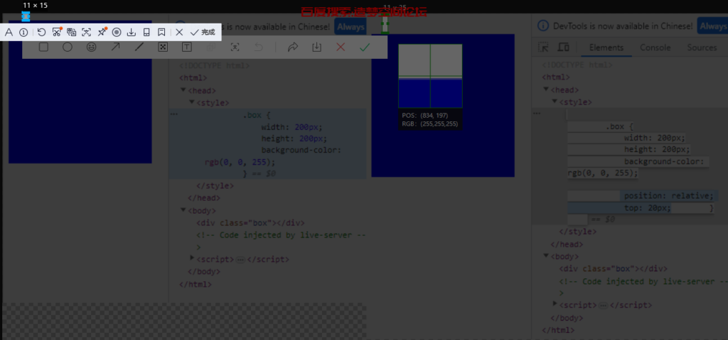
绝对定位:absolute:
- 如果没有祖先元素或者祖先元素没有定位,则以浏览器屏幕为准进行定位。

- 如果父元素有定位(相对、绝对、固定定位),那么以最近的父级为参考点移动。
<!DOCTYPE html>
<html>

<head>
    <style>
        .father {
            width: 200px;
            height: 200px;
            background-color: gray;
            position: relative;
        }
        .box {
            width: 50px;
            height: 50px;
            background-color: rgb(0, 0, 255);
            position: absolute;
            top: 0px;
            right: 10px;
        }
    </style>
</head>
<body>
    <div class="father">
        <div class="box"></div>
    </div>
</body>

</html>
注意:如果父级元素没有定位,但是上上级有定位,那也是以上上级做参考,找最近的有定位的一级。 - 绝对定位不在占用原先位置(脱离标准流)
<!DOCTYPE html>
<html>

<head>
    <style>
        .father {
            width: 200px;
            height: 200px;
            background-color: gray;
            position: relative;
        }
        .box {
            width: 50px;
            height: 50px;
            background-color: rgb(0, 0, 255);
            position: absolute;
            top: 0px;
            right: 10px;
        }
        .box1 {
            width: 100px;
            height: 100px;
            background-color: #ff0000;
        }
    </style>
</head>
<body>
    <div class="father">
        <div class="box"></div>
        <div class="box1"></div>
    </div>
</body>
</html>

 注意:如果父级元素没有定位,但是上上级有定位,那也是以上上级做参考,找最近的有定位的一级。
子绝父相:子级元素用绝对定位,父级元素要跟一个相对定位
案例:QQ在线状态
<html>
    <style>
        .box{
            position: relative;
        }
        .yuan {
            width: 80px;
            height: 80px;
            background-color: rgb(9,241,117);
            border-radius: 50%;
            position: absolute;
            bottom: 0;
            right: 0;
        }
    </style>
</head>
<body>
    <span class="box">
        <img src="https://blog.zmkj.website/api/qqtouxiang/?qq=1619539503" alt="QQ">
        <div class="yuan"></div>
    </span>
</body>
</html>
固定定位:fixed:
浏览器在滚动的时候是不会动的,以浏览器可视窗口移动。
王者荣耀侧边例子:

<html>
    <style>
        .box{
            position: fixed;
            top: 250px;
            right:50px;
        }
    </style>
</head>
<body>
    <span class="box">
        <img src="https://game.gtimg.cn/images/yxzj/web201706/images/comm/floatwindow/r_dj.png" alt="QQ">
    </span>
</body>
</html>
但是这个是固定定位是跟着屏幕来进行定位的,然后像有些文章是的比如返回顶部按钮,是紧紧贴着文章外面的右下角,那么这个实现起来也很简单,只需要先给这个返回顶部按钮设置固定定位,然后距离左边设置left: 50%;然后让他到达屏幕中间,然后在用margin-left:属性值就设置为文章盒子大小的一半即可,例子如下:
<html>
    <style>
        .box {
            width: 70%;
            height: 2000px;
            margin: 0 auto 0 auto;
            background-color: cadetblue;
        }
        .top{
            position: fixed;
            bottom: 100px;
            left: 50%;
            margin-left: 35%;
            width: 100px;
            height: 100px;
            background-image: url("https://ts4.cn.mm.bing.net/th?id=OIP-C.rfFYxzQmFAM3B-ZyuW18OAHaHa&w=249&h=250&c=8&rs=1&qlt=90&o=6&pid=3.1&rm=2");
            background-size: 100%;
        }
    </style>
</head>
<body>
    <div class="box">

    </div>
    <a href="#" class="top">
    </a>
</body>
</html>
这样就能不论屏幕如何变化都会贴着这个文章的侧边显示。


粘性定位:sticky
- 以浏览器的可视窗口为参照点移动元素(固定定位的特点)
- 占用原有原先的位置(绝对定位的特点)
- 必须添加top、right、buttom、left中的一个才会生效
注:兼容性不是很好,IE浏览器不支持使用。
比如说我们这个造梦空间论坛PC端的导航栏:

<html>
<style>
    body {
        height: 2000px;
    }
    .div1 {
        height: 500px;
    }
    .box {
        position: sticky;
        top: 88px;
        width: 120px;
        height: 410px;
        background-color: rgb(50, 51, 53);
        border-radius: 10px;
    }
</style>
</head>
<body>
    <div class="div1"></div>
    <div class="box">
</div>
</body>
</html>
定位的叠放顺序:z-index
在使用布局定位时,我们可以使用z-index来设置定位的叠放顺序,就是比如说你设置了2个定位,他们叠在一起了,然后我们如何规定他显示哪个在上层哪个在下层,在下层的肯定就被上面的挡住了,就是叠起来了。
使用方法:
选择器{z-index: 数值}可以是正数也可以是负数也可以是0,数值越大越靠上面显示(默认是后来者居上,后面写的会在上面)。
例子
在这个例子里面,默认是蓝色压在红色压在黑色上面。
-->
<html>
<style>
    .box1 {
        position: absolute;
        width: 100px;
        height: 100px;
        background-color: rgb(50, 51, 53);
        border-radius: 10px;
    }

    .box2 {
        position: absolute;
        width: 100px;
        height: 100px;
        top: 30px;
        left: 30px;
        background-color: rgb(233, 73, 73);
        border-radius: 10px;
    }

    .box3 {
        position: absolute;
        width: 100px;
        height: 100px;
        top: 60px;
        left: 60px;
        background-color: rgb(69, 93, 228);
        border-radius: 10px;
    }
</style>
</head>
<body>
    <div class="box1"></div>
    <div class="box2"></div>
    <div class="box3"></div>
</div>
</body>
</html>
但是我们可以给黑色盒子box1的z-index的值设置为1让他在上一层。
<html>
<style>
    .box1 {
        position: absolute;
        width: 100px;
        height: 100px;
        background-color: rgb(50, 51, 53);
        border-radius: 10px;
        z-index: 1;
    }

    .box2 {
        position: absolute;
        width: 100px;
        height: 100px;
        top: 30px;
        left: 30px;
        background-color: rgb(233, 73, 73);
        border-radius: 10px;
    }

    .box3 {
        position: absolute;
        width: 100px;
        height: 100px;
        top: 60px;
        left: 60px;
        background-color: rgb(69, 93, 228);
        border-radius: 10px;
    }
</style>
</head>
<body>
    <div class="box1">box1</div>
    <div class="box2">nox2</div>
    <div class="box3">box3</div>
</div>
</body>
</html>
然后在把红色盒子box2的z-index值设为2,大于box的1时则红色显示在上。
<html>
<style>
    .box1 {
        position: absolute;
        width: 100px;
        height: 100px;
        background-color: rgb(50, 51, 53);
        border-radius: 10px;
        z-index: 1;
    }

    .box2 {
        position: absolute;
        width: 100px;
        height: 100px;
        top: 30px;
        left: 30px;
        background-color: rgb(233, 73, 73);
        border-radius: 10px;
    }

    .box3 {
        position: absolute;
        width: 100px;
        height: 100px;
        top: 60px;
        left: 60px;
        background-color: rgb(69, 93, 228);
        border-radius: 10px;
    }
</style>
</head>
<body>
    <div class="box1">box1</div>
    <div class="box2">nox2</div>
    <div class="box3">box3</div>
</div>
</body>
</html>
当蓝色box3的z-index值设置为3时候,大于box1和box2则box会显示在最上面。
<html>
<style>
    .box1 {
        position: absolute;
        width: 100px;
        height: 100px;
        background-color: rgb(50, 51, 53);
        border-radius: 10px;
        z-index: 1;
    }

    .box2 {
        position: absolute;
        width: 100px;
        height: 100px;
        top: 30px;
        left: 30px;
        background-color: rgb(233, 73, 73);
        border-radius: 10px;
        z-index: 2;
    }

    .box3 {
        position: absolute;
        width: 100px;
        height: 100px;
        top: 60px;
        left: 60px;
        background-color: rgb(69, 93, 228);
        border-radius: 10px;
        z-index: 3;
    }
</style>
</head>
<body>
    <div class="box1">box1</div>
    <div class="box2">nox2</div>
    <div class="box3">box3</div>
</div>
</body>
</html>
绝对定位的盒子居中算法:
在我们之前有讲过,可以使用margin:0 auto;来给盒子进行居中对齐,但是加了绝对定位的盒子,现在在去使用这个就是没效果的。
首先我们可以先让加了绝对定位后的盒子往右边移动百分之50。

然后在往左边移动盒子大小的一般即可完成水平居中效果。

垂直居中同理,直接高度百分之50,然后在往上移动盒子的一半高度即可。
例子——轮播图切换按钮

<html>
<style>
    .box1 {
        position: relative;
        width: 500px;
        height: 200px;
        background-color: rgb(68, 71, 223);
        border-radius: 10px;
        left: 50%;
        margin-left: -250px;
    }
    .box2 {
        position: absolute;
        width: 50px;
        height: 50px;
        line-height: 50px;
        text-align: center;
        background-color: #5d6770af;
        top: 50%;
        margin-top: -25px;
    }
</style>
</head>
<body>
    <div class="box1">
        <div class="box2"><</div>
    </div>
</div>
</body>
</html>
定位的特性:
绝对定位和固定定位也和浮动类似
- 行内元素添加绝对或者固定定位,可以直接设置高度和宽度
- 块级元素添加绝对或者固定定位,如果不给宽度或者高度,默认大小是内容的大小
- 浮动元素、绝对定位(固定定位)元素的都不会触发外边距合并的问题(脱离标准流)
- 浮动的元素不会压住下面标准流的盒子,绝对定位和固定定位会完全压住盒子。
↑文字环绕效果建议使用浮动↑
 ↑文字环绕效果建议使用浮动↑


没有回复内容