

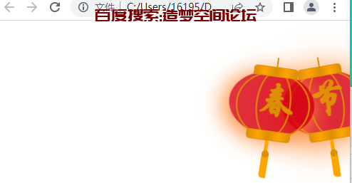
网页春节灯笼,可以支持任何站使用,效果如造梦空间论坛右上角一样。
HTML源码:
<div class="xiaobo-box">
    <div class="xiaobo">
      <div class="xian"></div>
      <div class="xiaobo-a">
        <div class="xiaobo-b"><div class="xiaobo-t">节</div></div>
      </div>
      <div class="shui shui-a"><div class="shui-c"></div><div class="shui-b"></div></div>
    </div>
  </div>

  <!-- 灯笼2 -->
  <div class="xiaobo-box1">
    <div class="xiaobo">
      <div class="xian"></div>
      <div class="xiaobo-a">
        <div class="xiaobo-b"><div class="xiaobo-t">春</div></div>
      </div>
      <div class="shui shui-a"><div class="shui-c"></div><div class="shui-b"></div></div>
    </div>
  </div>
css源码:
/**过年灯笼*/
.xiaobo-box {
  position: fixed;
  top: 40px;
  right: -50px;
  z-index: 999;
}

.xiaobo-box1 {
  position: fixed;
  top: 40px;
  z-index: 999;
  right: -20px;
}

.xiaobo-box1 .xiaobo {
  position: relative;
  width: 120px;
  height: 90px;
  margin: 50px;
  background: #d8000f;
  background: rgba(216, 0, 15, 0.8);
  border-radius: 50% 50%;
  -webkit-transform-origin: 50% -100px;
  -webkit-animation: swing 5s infinite ease-in-out;
  box-shadow: -5px 5px 30px 4px rgba(252, 144, 61, 1);
}

.xiaobo {
  position: relative;
  width: 120px;
  height: 90px;
  margin: 50px;
  background: #d8000f;
  background: rgba(216, 0, 15, 0.8);
  border-radius: 50% 50%;
  -webkit-transform-origin: 50% -100px;
  -webkit-animation: swing 3s infinite ease-in-out;
  box-shadow: -5px 5px 50px 4px rgba(250, 108, 0, 1);
}

.xiaobo-a {
  width: 100px;
  height: 90px;
  background: #d8000f;
  background: rgba(216, 0, 15, 0.1);
  margin: 12px 8px 8px 10px;
  border-radius: 50% 50%;
  border: 2px solid #dc8f03;
}

.xiaobo-b {
  width: 45px;
  height: 90px;
  background: #d8000f;
  background: rgba(216, 0, 15, 0.1);
  margin: -4px 8px 8px 26px;
  border-radius: 50% 50%;
  border: 2px solid #dc8f03;
}

.xian {
  position: absolute;
  top: -20px;
  left: 60px;
  width: 2px;
  height: 20px;
  background: #dc8f03;
}

.shui-a {
  position: relative;
  width: 5px;
  height: 20px;
  margin: -5px 0 0 59px;
  -webkit-animation: swing 4s infinite ease-in-out;
  -webkit-transform-origin: 50% -45px;
  background: #ffa500;
  border-radius: 0 0 5px 5px;
}

.shui-b {
  position: absolute;
  top: 14px;
  left: -2px;
  width: 10px;
  height: 10px;
  background: #dc8f03;
  border-radius: 50%;
}

.shui-c {
  position: absolute;
  top: 18px;
  left: -2px;
  width: 10px;
  height: 35px;
  background: #ffa500;
  border-radius: 0 0 0 5px;
}

.xiaobo:before {
  position: absolute;
  top: -7px;
  left: 29px;
  height: 12px;
  width: 60px;
  content: " ";
  display: block;
  z-index: 999;
  border-radius: 5px 5px 0 0;
  border: solid 1px #dc8f03;
  background: #ffa500;
  background: linear-gradient(to right, #dc8f03, #ffa500, #dc8f03, #ffa500, #dc8f03);
}

.xiaobo:after {
  position: absolute;
  bottom: -7px;
  left: 10px;
  height: 12px;
  width: 60px;
  content: " ";
  display: block;
  margin-left: 20px;
  border-radius: 0 0 5px 5px;
  border: solid 1px #dc8f03;
  background: #ffa500;
  background: linear-gradient(to right, #dc8f03, #ffa500, #dc8f03, #ffa500, #dc8f03);
}

.xiaobo-t {
  font-family: 华文行楷,Arial,Lucida Grande,Tahoma,sans-serif;
  font-size: 3.2rem;
  color: #dc8f03;
  font-weight: bold;
  line-height: 85px;
  text-align: center;
}

.night .xiaobo-t,
.night .xiaobo-box,
.night .xiaobo-box1 {
  background: transparent !important;
}

@-moz-keyframes swing {
  0% {
    -moz-transform: rotate(-10deg)
  }

  50% {
    -moz-transform: rotate(10deg)
  }

  100% {
    -moz-transform: rotate(-10deg)
  }
}

@-webkit-keyframes swing {
  0% {
    -webkit-transform: rotate(-10deg)
  }

  50% {
    -webkit-transform: rotate(10deg)
  }

  100% {
    -webkit-transform: rotate(-10deg)
  }
}@media screen and (max-width: 768px){.xiaobo-box{position: fixed; top: 23px; right: -50px; z-index: 999;}.xiaobo-box1 { position: fixed; top: 23px; z-index: 999; right: -20px; }}


没有回复内容